I'll be honest and say this without any shame*: I'm very proud of how my blog looks.
I loved it when it was just an idea. I was in heaven while setting up and fiddling with CSS. I was so obsessed with the final look that I often opened the blog simply to admire it. I was overjoyed when people highly complimented it after the blog launch. And till today, a compliment about my blog aesthetic is enough to make my day.
Now that it has been over a year and I know enough about not only creating a blog aesthetic but also maintaining it, I want to share what I've learned. I'll also take you along my brief process of setting it up because there is much to be gleaned from processes.
This post is inspired by an old Let's Talk Bookish prompt. Let's Talk Bookish is a weekly discussion thing with set prompts hosted by Aria @ Book Nook Bits.
*humility is for the weak.
- a little background
- creating my blog aesthetic
- maintaining my blog aesthetic
- FAQs?
- how much time do you spend on making your blog look nice?
- is it more about making it functional?
- are you still changing it around?
- do you ever feel like your blog design is not properly appreciated?
- what are the best tools you use to customize the look of your blog?
- is having a blog aesthetic worth it?
- endnotes
a little background
Before this blog, I had been blogging for over 5 years. 4 of those years were on a free WordPress site and one was with a paid WordPress plan. In all those years with WordPress, I did not have much freedom to create a good blog aesthetic. The themes are pretty rigid with the customization and the paid plan was no better.
Since my options were limited, I was never satisfied with the look of my blog. There was always something bothering me because it didn't look how I wanted it to. With any setup, I would become bored or annoyed within 2 to 3 months and start over. Hence, I played around with several themes and aesthetics.
I don't think I ever had my entire blog cohesive with the aesthetic but I did make sure that the sections I cared about were proper. Sometimes it was the header and menus, sometimes the sidebar and footer, and for a while, I only focused on the content itself (because wrangling themes became too irritating).
Playing around gave me a good idea of what I liked, what works, and what looks good. I played around with colours to create different vibes, noticed how some aesthetics don't go with my blogging voice, and learned what are the most important components.
All of that experience came in handy when I went self-hosted and finally had the freedom to make my blog look like my vision.
creating my blog aesthetic
A blog aesthetic is much more than colours and images. To me, a blog aesthetic is how it makes you FEEL. When you look at a blog, before you take in the individual colours, graphics, and layout, you take in the big picture. It makes you feel something—surprise, joy, comfort, etc. Only then will you notice the individual components. Sometimes, you won't even realize the small things that add to the overall feeling.
As I did not have a good idea for creating an entire aesthetic at once, I followed Ursa's guide to creating a blog aesthetic. I referred to the post several times because she has written the guide in an easy-to-follow manner and mentions very good points. Also, she has an amazing theme so she knows what she's talking about.
the colours
Right before this blog, I was on a Personal WordPress plan which gave me the option of a few paid themes. It looked SO DIFFERENT from what you're seeing today. My old blog aesthetic was pinks, purples, bright—fairy—colours, and foliage. I was feeling excited, passionate, and perky and the blog reflected that. Pink was the highlight because it was my favourite colour at the time.
But a few months later, I was tired of that theme. I was tired of trying to channel that energy all the time. Hence, while planning for the new blog aesthetic, I had two behind-the-scenes goals:
- Have a blog aesthetic that I won't get bored/annoyed/tired of soon.
- Have a blog aesthetic that is comfortable.
I have always subtly matched my writing style to my blog aesthetics. This time, I wanted to have an aesthetic that matched my blogging voice instead. The aesthetic had to be me and my personality online so that it didn't take too much work to maintain it.
Once I decided on "comfortable", it was easy to extend the idea to a few more keywords. Here's what I wanted people to feel when they open my blog:
- cosy.
- comfortable.
- friendly.
- casual/informal.
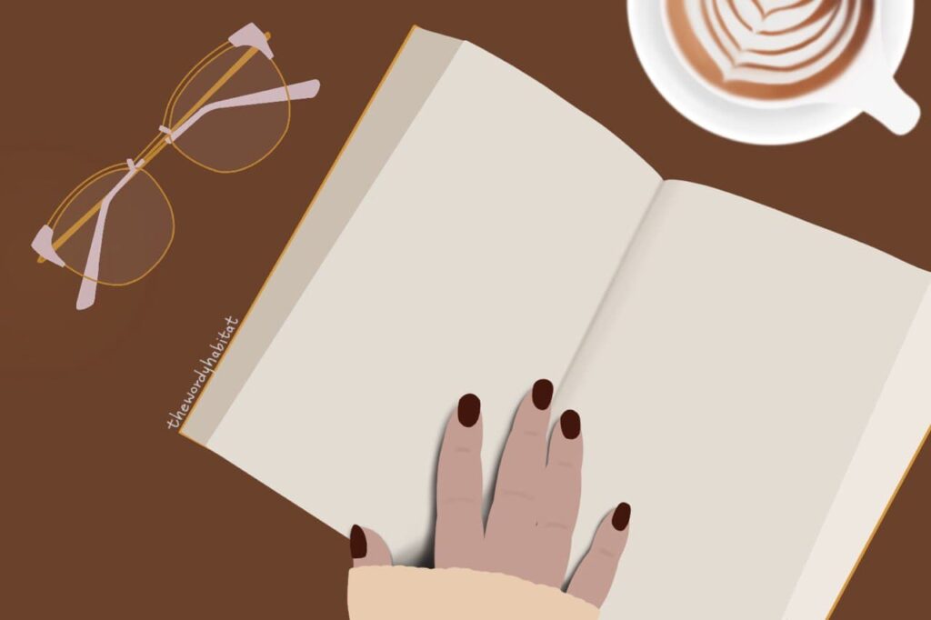
When I started thinking of colours to match my keywords, I immediately thought of browns and beige. It seemed like the natural choice because brown has been a low-key favourite of mine for years. I would seek out the colour in the smallest ways like wanting only brown curtains or loving my brown nail polish.
As I was planning the above and noting down ideas in my bullet journal, I used one of my brush pens. Specifically, the shade 991. I used it to highlight headings and it looked so good. I immediately wanted to add the same, or similar, colour to the blog for highlighting links. I still find it surprising that the brush pen I used while planning turned into a blog aesthetic choice.
A related quick tip: take inspiration from everything! Consider every colour that you like, that calls to you, and that you gravitate towards. Even if you suddenly like a colour, take it into consideration. They might just be what you need.
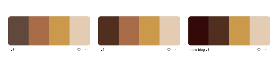
I went through a few versions of colour palettes before finally deciding on one. You'll notice that I eventually went for dull shades but I found that, in use, they felt much more "comfortable" than the rich shades. Especially brown.
the graphics
After deciding on the colours, my first concern/problem was graphics. I wondered how I would make my graphics work with them because I have never been good at following a theme for blog graphics. There are bloggers who do it really well but it doesn't work for me.
Although I enjoy the process of choosing stock photos to add to posts, creating blog headers, choosing fonts etc., it is not always satisfying. Here were some problems I could immediately think of:
- I like using images as dividers in my content but finding stock images to compliment my theme would be hard.
- I didn't want to continue using stock images at all—whether as dividers or backgrounds in header images.
- If I didn't use stock images, I could create graphics and dividers of my own using Canva. I have done it in my last pink theme but it was also an annoying process. While Canva is great, it does not provide all the freedom.
- It would be hard to create images with only one or two objects in focus—to keep it simplistic and "make a statement"—in Canva.
- I don't like to take my own photos. It is an entirely separate skill that I frankly suck at and don't have enough patience for.
And then, almost like magic, a solution came to me.
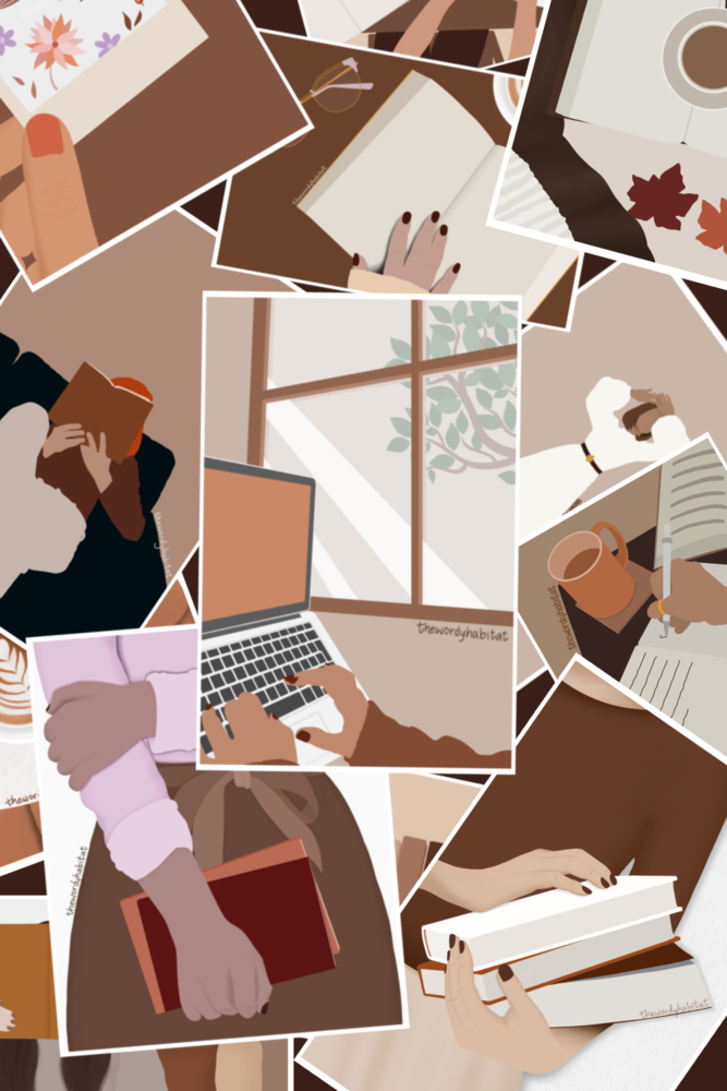
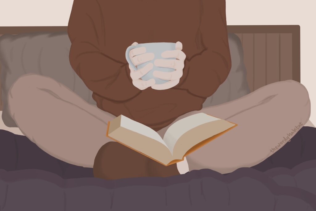
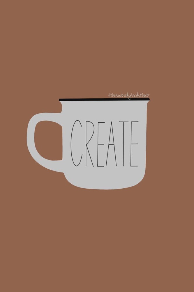
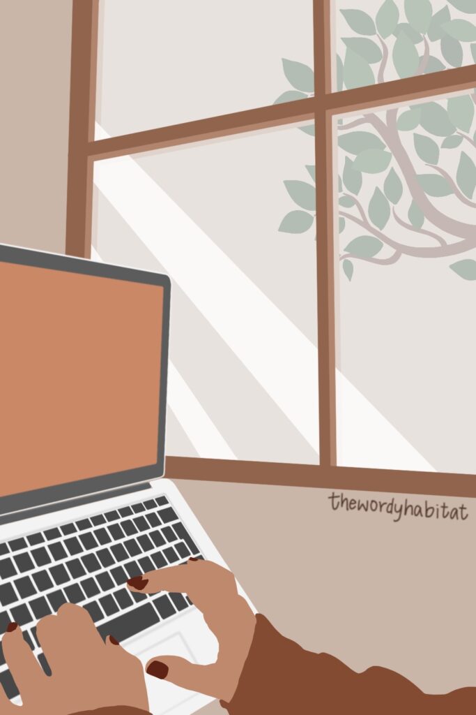
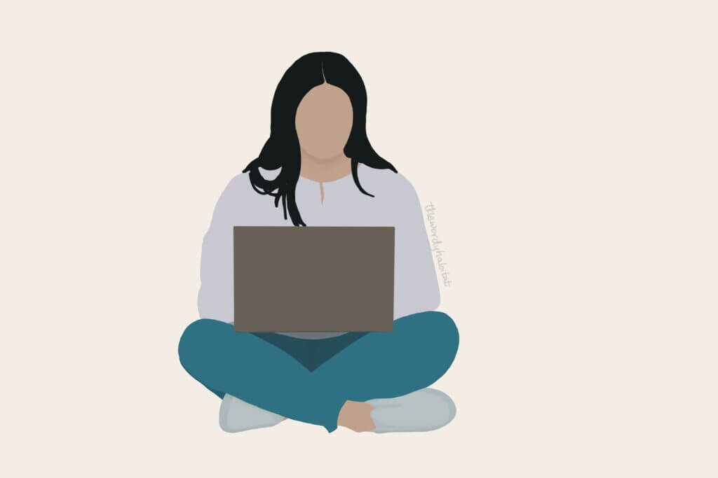
A couple of months before this planning stage, I had started dabbling in digital art. I have seen bloggers use only their own images throughout their blogs. What if I could do it with my digital art? I quickly set to trying it out by drawing an illustration using my rough colour palette in mind. And you know what, it turned out GREAT. I was a little apprehensive about committing to creating all the graphics myself but it gives me all the freedom and the decision felt right.
the blog theme
Then came the biggest part about having a blog aesthetic—the blog theme. I spent at least two weeks browsing through blog themes. I started it immediately after deciding to go self-hosted because it was the most exciting part, other than plugins.
By the time I decided on the colour palette, I already had a theme in mind. Unfortunately, it was double my budget and I was nervous about buying it. The theme also required a parent theme to be bought separately which further increased the cost. I spent a couple of weeks debating it and searching for alternatives when I saw that the Kylee More theme by Studio Mommy was available for a very affordable price. I snatched it up and decided to just go with it for now and save up for the other theme.*
*After setting it up and loving how my blog looks, I have since decided not to switch soon. If I do switch, it'll probably be to a newly found theme.
the fonts
Honestly, I didn't have much of an idea about fonts. I spent a while going through suggested pairings on Pinterest, checking out several random ones on Google fonts, and playing around with ones that caught my eye. But I couldn't come to a decision.
After buying the theme, I realized that I liked the theme's default body font Poppins. It looks quite cute with the rounded-letter style and is nicely spaced out. It also looks informal, somehow, which matched my keywords.
I wanted Playfair Display for the headings because it was one of my favourite fonts to use in Canva while making post headers. Thankfully, it matches Poppins pretty well so I went with it.
the wordy factors
Even though my older blog was also named "the wordy habitat," I didn't truly use the name throughout the blog other than in one series called "the chatty habitat." But this time, I thought of the little ways I could tie things to it.
And that's how I came up with calling y'all "citizens" of the wordy habitat, calling categories "spaces," calling myself "the mayor," etc. I'm sure I could do better but this is what I'm sticking with for now. It also adds to my day when y'all use these terms in the comments or emails—it makes my blog aesthetic more real.
While these terms are a small part of the blog aesthetic, I believe that they make a difference when people notice them. One of them alone might not be effective but when multiple related things are used throughout, they subtly reinforce the blog aesthetic.
maintaining my blog aesthetic
The best part of having a set blog aesthetic is that you have a blueprint to follow without worrying about making things look good. The colours, the fonts, and the images have been decided beforehand. All I do now is use those decisions.
Ever since launching the blog, I've spent minimal effort on maintaining it. Not much requires updating since I don't do structural or conceptual changes often.
I have the hex codes of my colours handy in Notion, ready to be used when I create anything. For example, Pinterest images or editing my newsletter. For my illustrations, I've created an extended palette with more shades of my original colours on Procreate. I almost exclusively use that colour palette when I draw.
If I make any changes to the blog layout which involve editing CSS, I have my colours and fonts ready. I don't spend time trying things out to see what works best.
The majority of my maintenance wrt. looks is making new illustrations. When I decided on this blog aesthetic, I promised myself that I would create a new illustration for every post (excluding book and Kdrama reviews). Hence, it is not surprising that I spend a lot of time on it.
A big part of maintaining the aesthetic is making sure my blogging voice and content reflect it. That is a behind-the-scenes thing that includes a bunch of small but distinctive changes. When I find myself using big words for no reason, I switch them out for more common words to keep things casual. I share my experiences in every post to add personal elements. My headings are never capitalized. And I don't shy away from using the word "I" or "you" because I find that they're the ones that make posts look like a conversation.
FAQs?
The Let's Talk Bookish hosts gave some really good questions to help with the prompt so I'll go through them and give you some more insight into my process.
how much time do you spend on making your blog look nice?
The planning took me 2-3 weeks. Since I spent a lot of time on planning, it reduced the time spent on everything else. I didn't do any rework because something didn't fit or spent time questioning if I'm doing it right.
Setting up the blog itself took 3 days because I worked on it non-stop. I loved the process of making it look exactly like how I envisioned it.
Creating new illustrations for posts generally takes me 1-3 hours per illustration. If I'm going for more elaborate ones with details, it takes longer. I admit, I often think about how I would have saved time if I went the stock images and Canva graphics route but I don't regret my decision. The final result looks much better this way.
is it more about making it functional?
To me, functionality is completely separate from blog aesthetics. We always have to make sure that the functionality works well and that nothing is broken. Blog aesthetic can get in the way of functionality sometimes but it depends on the planning and vision.
To me, blog aesthetics are independent of functionality. I might change my layout or theme tomorrow but if I keep the colours and graphics the same, the aesthetic will remain the same. I don't envision my blog aesthetic as a layout because I focus on the feeling. So, there's no "more about making it functional" because that is not a choice and it is not related to my aesthetic.
are you still changing it around?
No. I change a few things like widgets in the sidebar and what's displayed on the footer. I did try to change the layout once and quickly reverted because I didn't like it. Sometimes, I get other ideas and I think about them.
But nothing for the aesthetic i.e. the colours, images, vibe, etc. All of the changes are structural and functional. I'm pretty happy with my aesthetic and I don't see myself changing it anytime soon. I may try to improve it by working on the aesthetic-specific terms but nothing else.
do you ever feel like your blog design is not properly appreciated?
Absolutely not. Right from the time I launched this blog, I've been fortunate enough to receive tons of compliments. Even now, I sometimes get comments or DMs from people who found the blog through search engines. My blogging friends don't fail to show appreciation even if they've done it before (like when I tweeted about writing this post!).
And for the times when I don't feel appreciated enough or feel like a fraud (doubts that plague any creator), I maintain a little collection of compliments on my Notion. I copy and save compliments that make my day. I read them when I feel low and it always makes me feel better. (I highly suggest you do this too!)
I believe that appreciation is closely tied to how much effort is seen. In my post about the blogging lessons I've learned, I mentioned that passion is attractive. When you're passionate about something, you put a ton of effort into it. When that ton of effort is clearly visible, people definitely notice and comment on it.
The fact that I make my own illustrations for the blog is one thing that is mentioned a lot. I've seen friends and people online mention that titbit while talking about my blog. That is definitely because I put in the effort to draw every single illustration and continue doing it for every post. It is something that sets me apart but what matters is that it shows my effort.
I may be wrong with the above theory but I am pretty sure I'm right. Because I see how I react to content by other creators. The ones that stick in my mind are the ones that clearly took a lot of effort.
So, random tip: don't hesitate from showing your effort and share how much effort you put into anything. If blogging takes you 4 hours per post, say it! A lot of the time, people might not know how much effort you put into something and hence, might not appreciate it enough.
what are the best tools you use to customize the look of your blog?
CSS is the GOAT. Instead of relying on the theme and plugins alone, I used direct CSS to get a ton of the elements to look how I want them to. I will admit, that I am more comfortable with CSS than searching for plugins etc. as I'm a software engineer and CSS is basic knowledge for me. It has opened up all areas of my blog to customization.
My confidence in CSS is also why I don't worry about what theme I'm using. I can customize almost all parts of any theme that I choose. (If you require help with CSS, feel free to DM me anywhere!)
When I started with the theme, I did my illustrations on Krita with a drawing pad. A couple of months later, when I decided that I was worthy enough, I bought myself an iPad and an Apple pencil mainly to use Procreate for my illustrations. That has made drawing much easier and more enjoyable.
is having a blog aesthetic worth it?
It is definitely worth it. I love seeing the results of my efforts and receiving compliments for them. The pure joy in opening my blog every time and seeing the colours and images create a cohesive aesthetic is exhilarating.
Having a good aesthetic boosts my confidence like nothing else. Even though I'm still shy to share my blog with people in real life, I try to get over my shyness and share it because I want this beautiful blog to be seen. It is too nice to be hidden away.
The presence of a blog aesthetic also clearly makes a difference in building an audience. It makes new readers stay longer and helps in creating a more involved following. So yes, external validation is more with a blog aesthetic.
endnotes
I am not an expert on creating blog aesthetics. My process might not be the best one or maybe I could have done better. Sometimes, I wonder if I haven't discovered something simply because I don't do many changes to my blog aesthetic. And maybe, in a few months, I'll eat my words and switch to a very different aesthetic.
For now, this blog aesthetic works really well for me. I think a big reason why I'm happy with it is that I'm easy to please if I have to do less maintenance. I don't have the time to do much nowadays.
It also helps me make decisions by removing a bunch of options. I know that I have to stick to these images and colours. I don't spend time playing around with every option under the sun. It has also enabled me to get more creative by restricting my options and saving my time.
And in the end, my blog aesthetic is a reflection of my mental space when I blog. I like being in a comfortable space while I blog and often play soothing music in the background. I imagine that I'm sitting on a worn couch with you with a cup of tea while I say everything that I type. I don't like to be loud or controversial or dramatic.
It's only me and my thoughts on simple things like this blog and romance books and Kdramas. It is somewhere to get away from the stress of reality, just for a little while.
be wordy with me?
Do you think having a blog aesthetic is important? Have you created an aesthetic for your blog? What was your inspiration for it and how did you create it? Share your process with me and the other citizens in the comments!
Sumedha spends her days reading books, bingeing Kdramas, drawing illustrations, and blogging while listening to Lo-Fi music. Read more ➔
I learned a lot from you! Thank you so much!
glad i could help!